Experiments in a solarpunk art style
Solarpunk is a genre of Speculative Fiction that focuses on craftsmanship, community, and technology powered by renewable energy, wrapped up in a coating of Art Nouveau blended with African and Asian aesthetics.Some of the themes which were brainstormed in that original post were:
- Natural colors!
- Art Nouveau!
- Handcrafted wares!
- Tailors and dressmakers!
- Streetcars!
- Airships!
- Stained glass window solar panels!!!
- Education in tech and food growing!
- Less corporate capitalism, and more small businesses!
- Solar rooftops and roadways!
- Communal greenhouses on top of apartments!
- Electric cars with old-fashioned looks!
- No-cars-allowed walkways lined with independent shops!
- Renewable energy-powered Art Nouveau-styled tech life!
 |
| Drawing by Owen C. |
 |
| Neighbor Science Meme Farm (NSMF), from facebook |
 |
| by the author |
This method of creating an image is quite easy, and doesn't rely on a lot of painting skill. I don't have a pad or graphics tablet. I use only my mouse, so it's not easy to hand draw things.
The problem with that style is it needs to be very detailed, and that takes a lot of time. Maybe a whole evening for a single picture. I want images which I can do six or seven of in a single sitting.
 |
| By the author. |
The first idea I hit upon was a kind of "heat vision" like you might see from a thermal imaging camera. It was certainly quick and easy to make the images, and it fit well with the first story, set in a prison. But it's not really working out for a longer story. Also, there was a problem that the images often ended up too noisy and unreadable. Just not interesting.
 |
| by the author |
I also tried a kind of illustrative style, single color blocks, highly saturated color which doesn't fit with nature. I like the feeling of "unnatural colors". It turns simple images found on the web in to otherworldly designs. But it's still not quite what I'm seeing elsewhere.
 |
| by the author |
Although the original solarpunk description called for natural colors, the images I'm seeing tend to feature hyper saturated, or slightly-off, rotated color wheels. Green shifts to turquoise, red in to pink or orange.
 |
| uncredited, found on tumblr |
So maybe not totally alien colors, but at least color shifted.
 |
| missolivialouise, tumblr |
The dynamics of the art on display are not very action oriented. People, where they feature at all, mostly stroll from place to place. Like architectural or fashion models. Some solarpunk art is architecture.
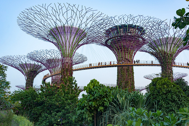 |
| Photo by xiquinhosilva |
Alternatively, the solarpunk people are busy interacting with some techno-greebles, doing something techie, or looking at plants or animals. No guns, no running or explosions. Solarpunk tends to be the kind of place where all the conflicts are internal.
 |
| 'Solarpunk Girl' by Matt Zeilinger |
For now I decided to use quick photo-manipulations, using found photos from google images, with a simple 2d filter to make them look more "painterly" and some color shifting to push them in to that 20 minutes in the future zone.
 |
| by the author, images from google images |
This is the same image I used earlier for the half moon village story. Dante and Hannah are talking in the kitchen. Being an indoor shot, the color tone is hot, hopefully evoking human emotions. It has three layers:
- Dante, a picture from google images with the search criteria "young man with beard"
- Hannah, again from google images, "Woman over the shoulder view"
- Ruined kitchen, google images, "old kitchen"
For an outdoor shot, I shifted the colors more to the green/blue end of the spectrum.
 |
| by the author |
I'm happy enough with this style. A few layers can be pasted together, a painterly filter applied, color shifted and maybe post processed a little. It's a quick and dirty result, but it helps to break up the wall of text and add some flavor to the stories. It also helps me to plan each story, thinking about the characters and the scenes I'm going to try to write about.
My stories are currently taking place in a world which is on its way to being solarpunk, but not quite yet. I want to show the new style emerging from the old.
 |
| by the author |
It's a world which is a bit messed up. Everything is a little bit off. The seasons are flowing a bit wrong. But as the story progresses, the colors and images should become more attuned to nature. The garish hues toning down to become less aggressive.


Comments
Post a Comment